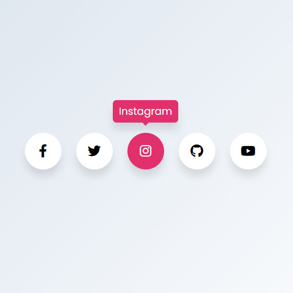
You need to use social buttons to increase your website ranking in Google search engine. In this post, you will see a model of displaying social buttons. These buttons come with a color change effect during hover time. By placing the mouse cursor on each of the buttons, the name of the button is written above the button. All stalls are circular and have a black icon.
HTML
<!-- This script got from www.devanswer.com -->
<link rel='stylesheet' href='https://cdnjs.cloudflare.com/ajax/libs/font-awesome/5.15.1/css/all.min.css'>
<div class="wrapper">
    <div class="icon facebook">
        <div class="tooltip">Facebook</div>
        <span><i class="fab fa-facebook-f"></i></span>
    </div>
    <div class="icon twitter">
        <div class="tooltip">Twitter</div>
        <span><i class="fab fa-twitter"></i></span>
    </div>
    <div class="icon instagram">
        <div class="tooltip">Instagram</div>
        <span><i class="fab fa-instagram"></i></span>
    </div>
    <div class="icon github">
        <div class="tooltip">Github</div>
        <span><i class="fab fa-github"></i></span>
    </div>
    <div class="icon youtube">
        <div class="tooltip">Youtube</div>
        <span><i class="fab fa-youtube"></i></span>
    </div>
</div><div id="bcl"><a style="font-size:8pt;text-decoration:none;" href="http://www.devanswer.com">Developers Answer</a></div>
CSS
@import url("https://fonts.googleapis.com/css2?family=Poppins&display=swap");
* {
	margin: 0;
	padding: 0;
	box-sizing: border-box;
}
*:focus, *:active {
	outline: none !important;
	-webkit-tap-highlight-color: transparent;
}
html, body {
	display: grid;
	height: 100%;
	width: 100%;
	font-family: "Poppins", sans-serif;
	place-items: center;
	background: linear-gradient(315deg, #ffffff, #d7e1ec);
}
.wrapper {
	display: inline-flex;
}
.wrapper .icon {
	position: relative;
	background-color: #ffffff;
	border-radius: 50%;
	padding: 15px;
	margin: 10px;
	width: 50px;
	height: 50px;
	font-size: 18px;
	display: flex;
	justify-content: center;
	align-items: center;
	flex-direction: column;
	box-shadow: 0 10px 10px rgba(0, 0, 0, 0.1);
	cursor: pointer;
	transition: all 0.2s cubic-bezier(0.68, -0.55, 0.265, 1.55);
}
.wrapper .tooltip {
	position: absolute;
	top: 0;
	font-size: 14px;
	background-color: #ffffff;
	color: #ffffff;
	padding: 5px 8px;
	border-radius: 5px;
	box-shadow: 0 10px 10px rgba(0, 0, 0, 0.1);
	opacity: 0;
	pointer-events: none;
	transition: all 0.3s cubic-bezier(0.68, -0.55, 0.265, 1.55);
}
.wrapper .tooltip::before {
	position: absolute;
	content: "";
	height: 8px;
	width: 8px;
	background-color: #ffffff;
	bottom: -3px;
	left: 50%;
	transform: translate(-50%) rotate(45deg);
	transition: all 0.3s cubic-bezier(0.68, -0.55, 0.265, 1.55);
}
.wrapper .icon:hover .tooltip {
	top: -45px;
	opacity: 1;
	visibility: visible;
	pointer-events: auto;
}
.wrapper .icon:hover span, .wrapper .icon:hover .tooltip {
	text-shadow: 0px -1px 0px rgba(0, 0, 0, 0.1);
}
.wrapper .facebook:hover, .wrapper .facebook:hover .tooltip, .wrapper .facebook:hover .tooltip::before {
	background-color: #3b5999;
	color: #ffffff;
}
.wrapper .twitter:hover, .wrapper .twitter:hover .tooltip, .wrapper .twitter:hover .tooltip::before {
	background-color: #46c1f6;
	color: #ffffff;
}
.wrapper .instagram:hover, .wrapper .instagram:hover .tooltip, .wrapper .instagram:hover .tooltip::before {
	background-color: #e1306c;
	color: #ffffff;
}
.wrapper .github:hover, .wrapper .github:hover .tooltip, .wrapper .github:hover .tooltip::before {
	background-color: #333333;
	color: #ffffff;
}
.wrapper .youtube:hover, .wrapper .youtube:hover .tooltip, .wrapper .youtube:hover .tooltip::before {
	background-color: #de463b;
	color: #ffffff;
}